Back
HealthMonit
AI powered remote health monitoring app for doctors and patients

Introduction
This project explores the design of a Remote Patient Monitoring (RPM) system, built to connect patients and doctors through real-time health tracking. The solution consists of two interfaces:
A mobile app for patients to track vitals, manage medications, and communicate with their care team.
A web dashboard for doctors to review patient health data, spot critical alerts, and provide timely interventions.
The design integrates data from connected health devices (e.g., Fitbit, Apple Health, glucose monitors) and offers fallback options for manual entry, ensuring accessibility for a broad patient base.

Problem statement
Chronic conditions like diabetes, hypertension, and heart disease require continuous monitoring. Patients often forget to track vitals or miss medications, while doctors struggle with fragmented or delayed data.
Key challenges identified:
Patients need a simple, non-intimidating way to log and share their health data.
Doctors require a clear, high-level overview of patients, without drowning in raw numbers.
Communication between patients and doctors should be contextual and efficient, not scattered across emails or phone calls.

Research and Synthesis
Methods used
Competitive analysis: Apple Health, Fitbit, Dexcom apps, Philips RPM, Teladoc.
Lightweight interviews / contextual inquiries with three health practitioners and two patients
Desk research on device ecosystems (HealthKit, Google Fit, Fitbit API, CGMs).
Top insights
Clinicians don’t need every number, they need signals and the ability to drill down for context.
Patients want reassurance and simple actions, not raw graphs.
Device fragmentation is real: many patients have at least one device, but not all; manual entry needs to be frictionless.
Alerts are useful but false positives cause alert fatigue, smart thresholds and trend-based alerts are preferred.

Information architecture & core user flows
I prioritized a small set of screens that tell the main story.
a) Wireframes & Iterations
Early sketches focused on minimizing cognitive load → fewer data points on the home screen.
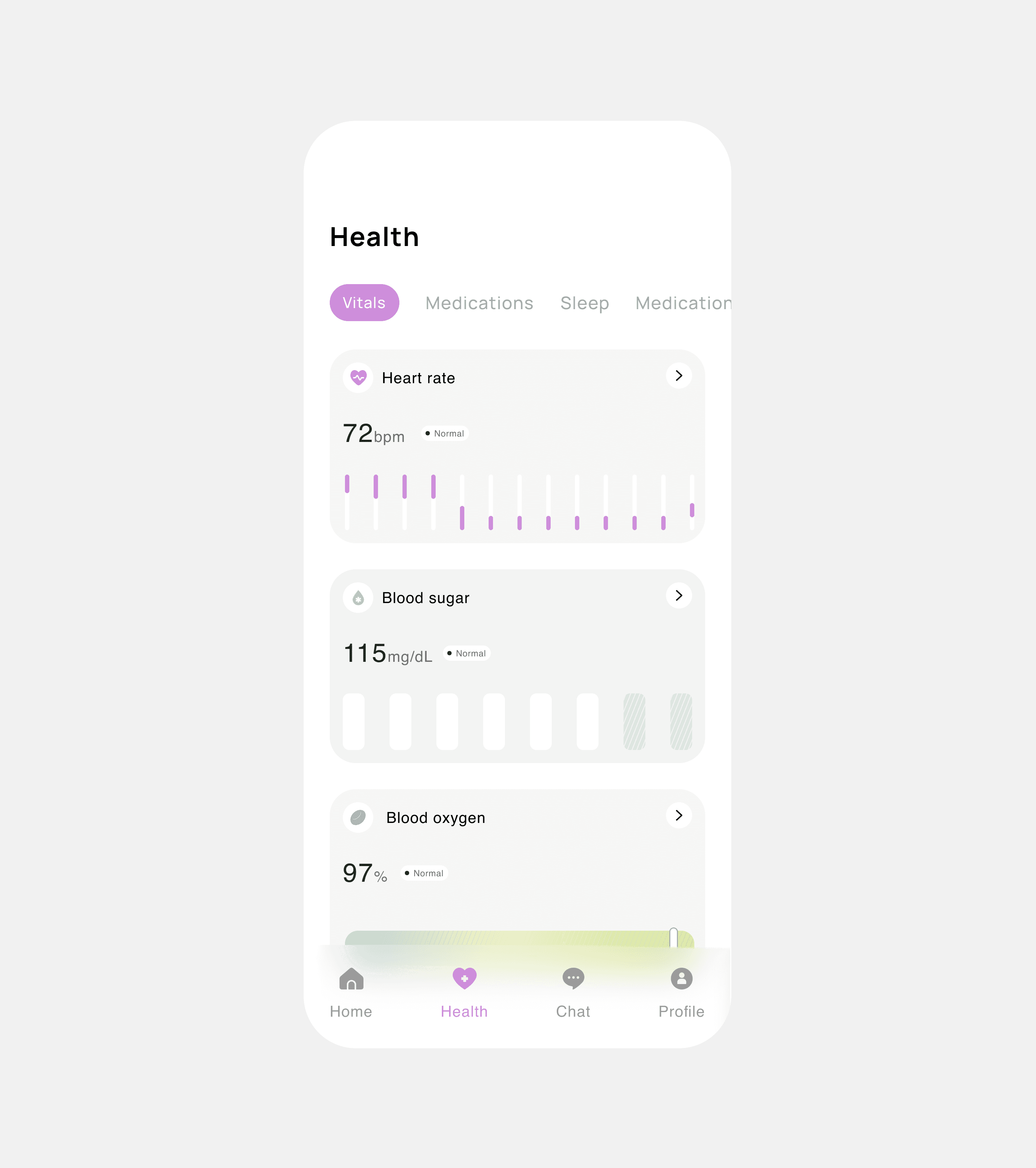
Added summary cards on homepage (Heart rate, BP, Blood sugar, SpO₂) with graphs moved to dedicated "Vitals" page.
Iterated the doctor’s dashboard to make chat collapsible, so doctors could multitask.
b) Key Features
Patient App
Vitals tracking (heart rate, BP, blood sugar, SpO₂)
Lifestyle tracking (sleep, activity, nutrition)
Medication reminders & "Mark as Taken" interaction
Overall health score with supportive captions
Secure chat with doctors
Doctor Web Dashboard
Patient list with search & filters
Patient profile page (snapshots, graphs, medication adherence)
Collapsible chat panel (inspired by LinkedIn/Twitter desktop)
Alerts system for abnormal readings
Appointment calendar + report export
Final design
Patient App (Mobile)
Onboarding: Gentle, skippable setup introducing the app benefits, followed by optional device connections. Framed in plain, friendly language to avoid medical intimidation.


Home Page: Four summary cards (Heart Rate, Blood Pressure, Blood Sugar, SpO₂), overall health score, and today’s reminders. The goal was to give patients a reassuring at-a-glance view rather than overload them with numbers.

Medication Page: Medication list with “Mark as Taken” buttons. This interaction was intentionally lightweight (single tap, no extra confirmations) to reduce friction.
Chat: Simple, secure messaging interface that lets patients communicate with their doctors directly within the app.

Doctor Dashboard (Web)
Dashboard Homepage: Overview of patients with quick metrics (important alerts, patient overview, recent messages, upcoming appointments).

Patient list: List of all patients with filters like condition and risk level. Also, a search bar to find patients.

Patient Details Page: Opens from the patient profile for a comprehensive view of the patient. Includes demographics, medical history, current medications, lab results and imaging, appointments and visit history, vitals trends, doctor’s notes and care plans, messaging/chat, and uploaded documents. Provides a detailed view without losing the context of the dashboard workflow.

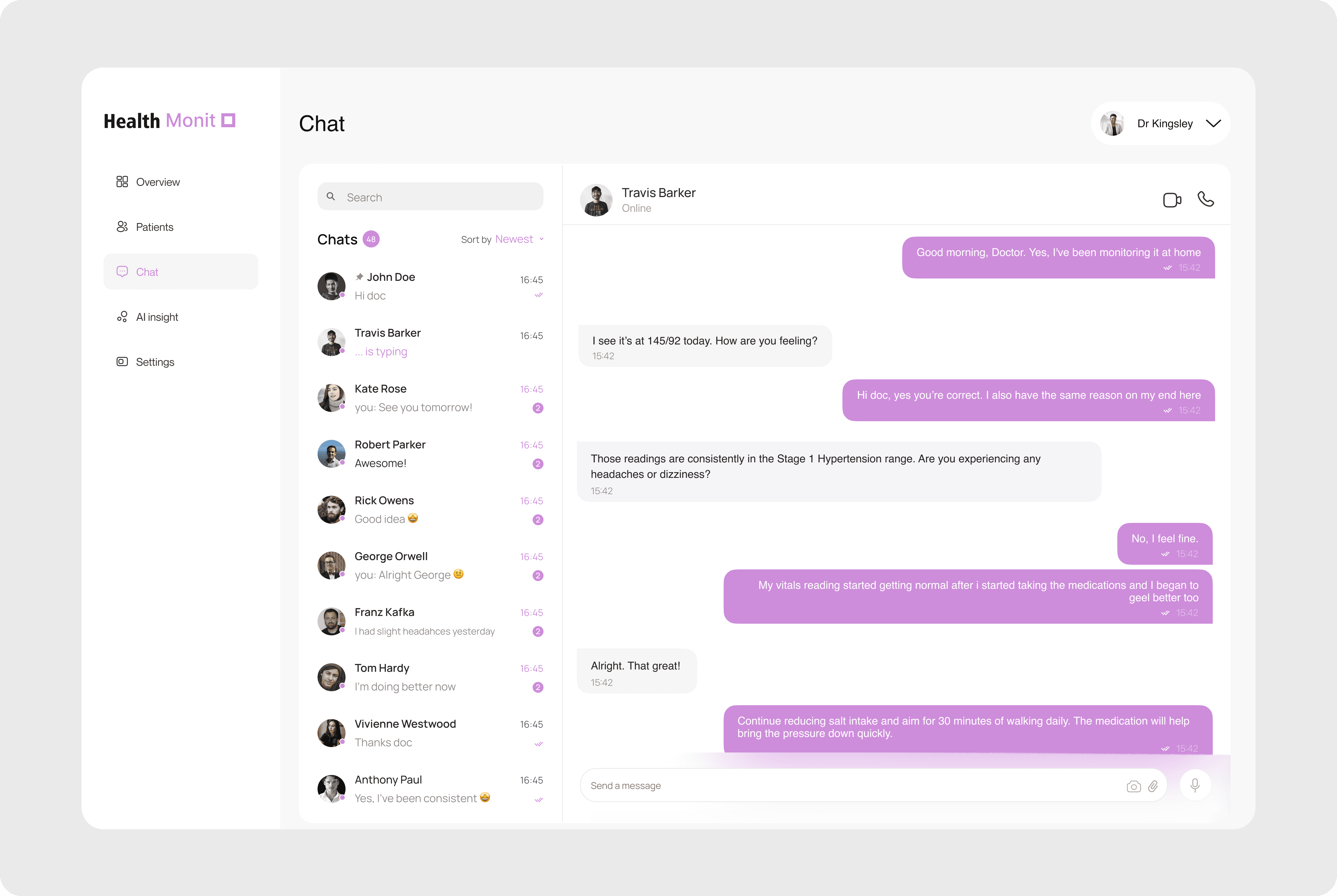
Collapsible Chat Panel: Inspired by LinkedIn/Twitter, chat slides in on the right. Doctors can review vitals while messaging, enabling multitasking.

Alerts Page: Prioritized feed of critical events (e.g., dangerously low SpO₂). Reduces cognitive load by surfacing what matters most first.


Chat Page: Centralized communication hub for doctors and patients. Displays a list of active chats on the left and the active conversation on the right. Each chat thread links directly to the corresponding patient’s profile for quick context.
Problems encountered and how I solved them
Problem: Data overload on the doctor side
Doctors don’t have the time to comb through endless raw numbers. Early explorations risked flooding them with charts, which would have been overwhelming and inefficient.
How I solved it: I prioritized data using a risk scoring system that highlights only high-risk patients and recent abnormalities by default. Filters allow doctors to expand the view when needed, but the default state surfaces what’s most urgent first.
Problem: Users without connected devices
Not every patient has access to a smartwatch or glucometer. Making device integration mandatory would have excluded many users.
How I solved it: I designed a frictionless manual entry flow where patients can quickly input values with minimal fields and a time picker. These entries are treated equally with device data but tagged with a “manual” label for transparency.
Problem: Alert fatigue and false positives
If the system flagged every minor fluctuation, both doctors and patients could lose trust.
How I solved it: I designed trend-based alerts that only trigger when abnormal readings occur consistently or in combination. Doctors also have the ability to adjust thresholds, giving them control over what’s considered “critical.”
Problem: Balancing graphs for two audiences
Patients needed visuals they could understand at a glance, while doctors required detailed data.
How I solved it: I applied a layered complexity approach—patients see simplified charts with ranges shaded green/yellow/red for reassurance, while doctors can toggle daily/weekly/monthly views with precise values.
Outcome & Impact (Hypothetical)
If implemented, this design could:
Reduce doctor’s time spent piecing together patient data.
Improve medication adherence by 20–30% (through reminders).
Give patients a sense of control & reassurance via health scores.
Provide a scalable model for AI-assisted population health management.
What I learned
This project taught me that designing for healthtech is less about flashy UI and more about clarity, trust, and balance. I learned how to present complex data in ways patients can understand without losing the precision doctors need, how to avoid overwhelming users with alerts, and how to design inclusively for people with or without connected devices. More than anything, it reinforced that good UX means thinking beyond screens—it’s about creating systems that truly fit into people’s lives.